
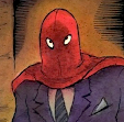
Here is a drawing I did for the cover of Drawn & Quarterly back in 1991, when it was known more for being a magazine - and not the quality publisher it has grown into. I don't know why that hard-edged box with the logo had to crop off the top of the drawing -- there was maybe another inch of art up there. I suppose I may have gotten the dimensions wrong. (Yet another of those annoying glitches that became a thing of the past once everyone started designing on computers). They did do a nice job of matching the color of the logo to the art.

Found this in my local comic shop today. Had to buy it.
ReplyDeleteAction Ash