Pages

Wednesday, October 28, 2009

Halloween Week - Part 2

Set of Halloween cards, using images of silk-screened art created for a 1994 Halloween art show.


Uncut silkscreen of black cat image, 14" x 18", 1994.


Uncut silkscreen of Jack-O-Lantern image, 14" x 18", 1994


Original Jack-O-Lantern line art. Pen & Ink, 14" x 18", 1994.


Front and back views of the package of "Halloween Hang-ups" made for the 1994 show. We only made around 65 of these packages, containing the hand-cut silkscreens. There were three different designs in each package, each with a stapled photocopied red cardstock header. It was all very "crafty" & low-tech & home-made. They were just intended to add a bit more fun to the show -- affordable souvenirs to be sold during the reception. When I had the opportunity to do a set of Halloween cards several years later, I decided to reuse these designs, since I was always kind of fond of them and was sorry we hadn't done a larger edition (the original group sold out within a week, although I set aside some for myself, most of which have since been sold). Below is the poster for the show:


Tuesday, October 27, 2009

It's Halloween Week


Top to bottom:
(1) Halloween illustration for The New York Times from several years ago.
(2) Monster who originally appeared on an Evil Eye letter page.
(3) Art for the poster of my 1994 Halloween Show at a now-defunct gallery in San Francisco.

Tuesday, October 6, 2009

Half-Minute Horrors Preview


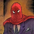
Here is a sneak peak at the two-page comic I wrote and drew for the book mentioned in the previous post -- a new book of short scary stories for kids, perfect for Halloween! The story is called "The Old Man In The Picture."


Note: All proceeds go to a non-profit organization dedicated to giving children from low-income families the opportunity to read and own new books -- so this is one you don't have to feel guilty about buying.

New Book Of Short Scary Stories For Kids


Amazon.com Book Description --

How scared can you get in only 30 seconds? Dare to find out with Half-Minute Horrors, a collection of deliciously terrifying short short tales and creepy illustrations by an exceptional selection of writers and illustrators, including Jonathan Lethem, Lemony Snicket, James Patterson, Joyce Carol Oates, Neil Gaiman, R.L.Stine, Faye Kellerman, Margaret Atwood, Lane Smith, Richard Sala and many more. With royalties benefiting First Book, a not-for-profit organization that brings books to children in need, this is an anthology worth devouring. So grab a flashlight, set the timer, and get ready for instant chills!

Edited by Susan Rich
Ages 9-12
Hardcover: 160 pages
Publisher: HarperCollins

Wednesday, September 30, 2009

October!

To kick off my favorite month, here is an illustration I did for the Oct. 1991 issue of (the original) National Lampoon. The mag had seen far better days by then, but some of the good people were still there, although not for much longer...

Thursday, September 17, 2009

Notes on the original art for DELPHINE


The DELPHINE series was always intended to be printed in sepia tones. However, I created the original art using blue washes, which, for some reason I found allowed me to "see" the values - from light to black - more clearly than when I was working with brown washes (yes, there was some early hit and miss experimenting). Working with blue washes seemed easier on the eye and each panel appeared more spacious and atmospheric in shades of blue. As one of my art teachers pointed out many years ago, "blue is the color of infinity". Perhaps it is this quality that made it easier for me to see the range of values as I painted.

When I painted in browns, the darks never seemed dark enough and the light areas seemed too close to the medium range. At worst the brown washes would appear flat and solid -- which I knew wouldn't necessarily be the case in the printed version (especially with the warm cream colored paper). When I realized I was beginning to overwork panels to make them "finished", I went back to blue and did the rest of the art that way. (I realize that this may just be a personal quirk -- but I've learned that "going" with personal quirks when they show up is often a good idea!).

I then scanned all the art myself and adjusted the color from "full-color" blue and black to the duotone of brown and black. In order to fit the art for each page on my scanner, I divided each page into three (with the exception of a few pages that had larger panels) -- each painting representing one of the page's three tiers.
I'm posting a few examples. Many more can be viewed (and are, in fact, for sale) at the Comic Art Collective --


I've recently added new batches of tiers from DELPHINE #1 and #4 there, which haven't been offered for sale before. Each is done in watercolor & ink on 7" x 12" Arches watercolor paper. If you are interested in purchasing any: prices for individual tiers are sixty dollars each and buyers can use Paypal if they wish. You may either click to purchase art on the CAC site or write to me directly at richard@richardsala.com and let me know which pieces you are interested in. That's a faster way to do it sometimes. (The CAC guy - Mr. Jeff Voris -- is truly a saint, and it's less work for him if you write me directly). Any purchased art will be neatly signed, just outside the panel.

I have other art for sale on the site, as well, at a variety of prices. But I decided to keep all the Delphine tiers fairly affordable and set one price instead of deciding if this tier should cost more than that one.

Thank you to those interested in the process for reading all this shop talk -- and my apologies if the notes devolved into something resembling a sales pitch! Just wanted to cover all bases! And I'm a lover of original comic art & illustration art - and all their "imperfections" - myself.