Pages

Showing posts with label Process. Show all posts

Wednesday, February 22, 2012

Another Revised EVIL EYE Cover


Here was how I originally planned the front and back covers of Evil Eye #4 to look.  I had a lot of fun drawing the two recurring "stars" of the book, Peculia and Judy Drood, surrounded by movie monsters from the pages of old issues of Famous Monsters of Filmland.  But - as often happens - I changed my mind.  So -- I used the paintings for back covers instead, as you can see in the proofs below for issues #4 and #5.  
The reason the rejected cover above is numbered 7 is because, in order to show what the finished version might have looked like, I used photoshop to cut & paste the logo and text from the cover of issue #7 (which has a red background that matches that of the rejected cover; I just blended it it in so you can see how the logo and text would have fit).


Sunday, February 5, 2012

Behind the scenes: Before and After


Cover for Evil Eye #12
Above:  Ink drawing before adding watercolor
Below: Final printed cover


Re-creation of a vintage comic book cover ~
Above: Ink drawing before adding watercolor
Below: Finished art


Behind the scenes BONUS:  
Original cover for Evil Eye #12, 
It was used in ads, but I decided to 
change it to the cover you see at the top of this post.


Tuesday, September 28, 2010

"Invisible Hands" Storyboards


Here are the storyboards I wrote & drew for the third episode of "Invisible Hands". In the previous blog entry, I posted some of the final drawings that were actually used in this episode. (For more info, see my other "Invisible Hands" posts).

(note: Animated version of "Invisible Hands" is copyright MTV and Colossal Pictures. Print version of "Invisible Hands" is copyright Richard Sala).

Still more "Invisible Hands" art...


Here is some of the art that was drawn for the third episode of "Invisible Hands" (Please see previous two posts for more information).

(note: Animated version of "Invisible Hands is copyright MTV & Colossal Pictures. Print version of "Invisible Hands" is copyright Richard Sala).

Monday, September 27, 2010

More art from "Invisible Hands"


As promised (threatened?) in my last post, here is more of the art I created for the animated version of "Invisible Hands".

From top to bottom:

- A panel from the original comic, as it appeared in Night Drive.

- Scene from the Voss & Crawley Bait & Tackle Shop, showing the three separate layers - foreground, middle and background.

- Three sets of various drawings of characters & objects used in the final animation.

More to come!

(note: Animated version of "Invisible Hands" is copyright MTV & Colossal Pictures. Print version of "Invisible Hands" is copyright Richard Sala)


Thursday, September 23, 2010

The art of "Invisible Hands"


"Invisible Hands" was a six-part animated serial which aired on MTV in the early 1990s. MTV had hired Colossal Pictures, an animation studio located in the Bay Area (where I was, too) to produce Liquid Television, a show that would feature lots of new animation. After one of the producers saw "Invisible Hands" in Night Drive, my first (self-published) comic, which was then selling at City Lights and other independent bookstores in the San Francisco area, I was hired to write and draw an expanded version for their show. The first season of Liquid TV was to consist of six episodes, and "Invisible Hands," which I had written as a tongue-in-cheek version of old-time mystery thrillers, would run in each episode as two-minute chapters of a complete 12-minute serial.

So I went to work expanding the story, drawing the story-boards and lots of new art. Then I'd drive them over to Colossal where the staff would blow up my drawings onto colored paper. Next, the director, Denis Morella, made the art come alive by photographing the cut-outs (which were positioned on three layers of glass to give the illusion of depth) using stop-motion. It was pretty primitive, I guess, but I really liked the jerky effect that resulted.

"Invisible Hands" was shown a lot on MTV during the early 1990s, sometimes even in a complete 12-minute version. MTV & Colossal kept all the original artwork I did, but luckily I made a bunch of photocopies, which, I recently realized, I've never shown before. So, here are a few for now. I can post some more soon, as well as some of the storyboards.

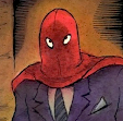
At the top is my drawing for the opening credits. Next, the original promotional postcard, advertising the debut of Liquid TV, with a scene from "IH" (the costume party) on the front, followed by more of my drawings -- characters, interiors & exteriors --- before they were transferred to colored paper.

I used to get asked about this serial a lot. It's never been on video in either VHS or DVD (there are reasons) though other Liquid TV animations were. However, it has been on YouTube for a long time now, so I don't get asked about it as much as I once did. I'm just glad that folks can (finally) see it again if they want to. And I hope some people may enjoy a look at the drawings I did for it.

(note: Animated version of "Invisible Hands" is copyright MTV & Colossal Pictures. Print version of "Invisible Hands" is copyright Richard Sala)

Wednesday, September 15, 2010

Sketchbooks pages of the past


Years and years and years ago there was a magazine that printed pages from artists' sketchbooks. They asked me to contribute, so I photocopied a bunch of pages, then cut & pasted the sketches so I could get in as many little drawings on the four pages I was given as possible. (I mean, some of the actual pages only had one or two drawings on them -- not very interesting, visually, I thought; plus I couldn't figure out which four pages to use -- so that was my solution; I reduced them & cut out the drawings & fit them all neatly together, with the goal that they just be fun to look at.)

Anyway, I'm kind of glad I made copies of these pages because a few years later these and other sketchbooks were destroyed by water damage. There was a leak in the ceiling directly over the cabinet where the books were stored, which I didn't notice until it was way too late.

So -- here is a glimpse of some of my sketchbook pages from days gone by...

Thursday, September 17, 2009

Notes on the original art for DELPHINE


The DELPHINE series was always intended to be printed in sepia tones. However, I created the original art using blue washes, which, for some reason I found allowed me to "see" the values - from light to black - more clearly than when I was working with brown washes (yes, there was some early hit and miss experimenting). Working with blue washes seemed easier on the eye and each panel appeared more spacious and atmospheric in shades of blue. As one of my art teachers pointed out many years ago, "blue is the color of infinity". Perhaps it is this quality that made it easier for me to see the range of values as I painted.

When I painted in browns, the darks never seemed dark enough and the light areas seemed too close to the medium range. At worst the brown washes would appear flat and solid -- which I knew wouldn't necessarily be the case in the printed version (especially with the warm cream colored paper). When I realized I was beginning to overwork panels to make them "finished", I went back to blue and did the rest of the art that way. (I realize that this may just be a personal quirk -- but I've learned that "going" with personal quirks when they show up is often a good idea!).

I then scanned all the art myself and adjusted the color from "full-color" blue and black to the duotone of brown and black. In order to fit the art for each page on my scanner, I divided each page into three (with the exception of a few pages that had larger panels) -- each painting representing one of the page's three tiers.
I'm posting a few examples. Many more can be viewed (and are, in fact, for sale) at the Comic Art Collective --


I've recently added new batches of tiers from DELPHINE #1 and #4 there, which haven't been offered for sale before. Each is done in watercolor & ink on 7" x 12" Arches watercolor paper. If you are interested in purchasing any: prices for individual tiers are sixty dollars each and buyers can use Paypal if they wish. You may either click to purchase art on the CAC site or write to me directly at richard@richardsala.com and let me know which pieces you are interested in. That's a faster way to do it sometimes. (The CAC guy - Mr. Jeff Voris -- is truly a saint, and it's less work for him if you write me directly). Any purchased art will be neatly signed, just outside the panel.

I have other art for sale on the site, as well, at a variety of prices. But I decided to keep all the Delphine tiers fairly affordable and set one price instead of deciding if this tier should cost more than that one.

Thank you to those interested in the process for reading all this shop talk -- and my apologies if the notes devolved into something resembling a sales pitch! Just wanted to cover all bases! And I'm a lover of original comic art & illustration art - and all their "imperfections" - myself.

Wednesday, June 24, 2009

Vampires!


From the archives: two different versions of the cover art for my modest 2003 vampire novella, Peculia And The Groon Grove Vampires. The first version was misguided, really. I wanted to do kind of an amoeba-shaped portal through which you could see a scene from the story. Well, it looked good as a sketch anyway! The real mistake was doing such a hard-edged shape (which is not the best solution with watercolor, which favors softer edges) and then
making the background a solid black. I often get inspired by cool hard-edged designs on book covers and subsequently make an attempt to duplicate it with watercolor. In never works... And what made it worse was that now the "view" through the portal needed to be lighter, to stand out from the black. So -- that's right, I made it a daytime scene. I have vampires strolling along during daytime. Oops...


Even though I kind of dashed off the second version, it still made a better cover than the first. Neither one has much to do with any actual scene from the story. I just wanted kind of dynamic image to convey a certain mood. I don't know. Like many of my paintings, I wish I had just one more shot to make it better. But you have to let go of these things once they're out there in the world...


Here is a scene from the book...


Monday, June 22, 2009

Gallery Ghost

A couple of years ago I got an assignment to do the cover ( as well as dozens of interior drawings) for an oversize hardcover book for kids called "Gallery Ghost". The story (actually a clever game) involves the ghosts of artists whose work is in the National Gallery (where the story takes place) coming out at night and adding little details to each other's work. An art student who works the night shift cleaning up the gallery discovers these paranormal hi-jinks and the ghosts allow her to participate in the fun. Anyway -- after the usual round of thumbnails, a cover idea was chosen and a full-size sketch was made.
At the same time I had also done a sketch for a border that was going to go on the title page.


A suggestion was made that perhaps the border could be used on the cover instead, so I did a mock-up to see how that would look.

Luckily everyone agreed it was way too busy. (The border didn't even end up in the final version of the book.) So we went back to the more simple cover illustration. I did the final and the designer added type, as well as the images of actual paintings.


Saturday, June 6, 2009

For Those Interested In The Process...

I always ink the artwork I do before applying the watercolor washes. Sometimes I photocopy the line art so I have a record of what it looked like in case I screw up the painting and have to start from scratch. (It's easier to start over by tracing line art than a painting). And sometimes I even save the photocopies of the line art, for some reason. Above is the line art I saved for the front cover of the book PECULIA. At the right is a (slightly dark) scan of the painted art, made after coloring with watercolor washes over the ink lines.
The scan was made at the point when I thought I was done. But after living with it some more (always a good idea), I decided it needed more work.
I lightened her dress (a laborious process that involves blotting the painted area with a wet rag or paper towel to slowly lift off the layers of watercolors, without smudging or smearing any of the areas around it). I had wanted a monochromatic look, but there wasn't enough of a range of values, so lightening the dress, and tweaking the color to be more purple than blue, helped. (I changed the color of the cat as well). Then, for balance, I realized I needed to darken the ground, so I did. I still wasn't 100% satisfied, but I knew I was on the verge of overworking it -- the worst thing you can do with a watercolor painting. If it was oil or acrylic or whatever I'd be able to paint over areas -- and you can even "fake" small areas of watercolors by matching the color in opaque gouache and painting over the watercolor that way. But I'm addicted to the light, transparent look of watercolor and although I have used gouache for corrections occasionally, I really try to avoid it, because the comparative heaviness of the opacity can throw the whole "look" off. So, I reluctantly laid down my brushes. (The age-old question for many a painter is "when is the painting done?" It's easier with watercolor, since you are definitely done when you should have already stopped working on it!).


So I packaged the art along with the title logo I'd drawn and sent it to the publisher, who put together a mock-up of the cover for me to see. That's it at the left. And that's what we went with. (Looking at it now, I think I should have added a bit of shading to her dress. Oh well...) Of course, the final printed version often doesn't look anything like the work at
this stage, so all that's left to do is cross your fingers and hope that they get it as close to the original art as possible. It used to be nearly impossible to get an accurate reproduction of watercolor art in print. I used to have to jack up the color intensity with garish dyes to prevent illustrations in magazines and newspapers from looking completely faded out. And you never knew how it would reproduce until you saw it -- an often disheartening experience! Nowadays, though, thanks to computers, you can get closer than ever to what the original painting looks like. Yay for technology! It's given new life to the old arts. (And to the old artists!).