Pages

Showing posts with label Original Art. Show all posts

Thursday, January 14, 2010

NIGHT GALLERY 2


Presented for your inspection -- Three more pictures from the vault...

From top to bottom:
- Art for cover of "Evil Eye" #11
- Art for two-page spread from Steve Nile's DRACULA (Jonathan Harker freaks out)
- "The Pirate's Treasure" featuring the pirate girls from MAD NIGHT, which appeared on the back cover of an issue of "Evil Eye"

Tuesday, December 15, 2009

DELPHINE Examined


Thank you to Ng Suat Tong for his thoughtful and insightful 7-page (!) review of the DELPHINE series on the (brand new) website for The Comics Journal:


Top: Blurry snapshot of original cover art for DELPHINE #4 I took for reference before sending them to the publisher...


Tuesday, November 3, 2009

Wednesday, October 28, 2009

Halloween Week - Part 2

Set of Halloween cards, using images of silk-screened art created for a 1994 Halloween art show.


Uncut silkscreen of black cat image, 14" x 18", 1994.


Uncut silkscreen of Jack-O-Lantern image, 14" x 18", 1994


Original Jack-O-Lantern line art. Pen & Ink, 14" x 18", 1994.


Front and back views of the package of "Halloween Hang-ups" made for the 1994 show. We only made around 65 of these packages, containing the hand-cut silkscreens. There were three different designs in each package, each with a stapled photocopied red cardstock header. It was all very "crafty" & low-tech & home-made. They were just intended to add a bit more fun to the show -- affordable souvenirs to be sold during the reception. When I had the opportunity to do a set of Halloween cards several years later, I decided to reuse these designs, since I was always kind of fond of them and was sorry we hadn't done a larger edition (the original group sold out within a week, although I set aside some for myself, most of which have since been sold). Below is the poster for the show:


Thursday, September 17, 2009

Notes on the original art for DELPHINE


The DELPHINE series was always intended to be printed in sepia tones. However, I created the original art using blue washes, which, for some reason I found allowed me to "see" the values - from light to black - more clearly than when I was working with brown washes (yes, there was some early hit and miss experimenting). Working with blue washes seemed easier on the eye and each panel appeared more spacious and atmospheric in shades of blue. As one of my art teachers pointed out many years ago, "blue is the color of infinity". Perhaps it is this quality that made it easier for me to see the range of values as I painted.

When I painted in browns, the darks never seemed dark enough and the light areas seemed too close to the medium range. At worst the brown washes would appear flat and solid -- which I knew wouldn't necessarily be the case in the printed version (especially with the warm cream colored paper). When I realized I was beginning to overwork panels to make them "finished", I went back to blue and did the rest of the art that way. (I realize that this may just be a personal quirk -- but I've learned that "going" with personal quirks when they show up is often a good idea!).

I then scanned all the art myself and adjusted the color from "full-color" blue and black to the duotone of brown and black. In order to fit the art for each page on my scanner, I divided each page into three (with the exception of a few pages that had larger panels) -- each painting representing one of the page's three tiers.
I'm posting a few examples. Many more can be viewed (and are, in fact, for sale) at the Comic Art Collective --


I've recently added new batches of tiers from DELPHINE #1 and #4 there, which haven't been offered for sale before. Each is done in watercolor & ink on 7" x 12" Arches watercolor paper. If you are interested in purchasing any: prices for individual tiers are sixty dollars each and buyers can use Paypal if they wish. You may either click to purchase art on the CAC site or write to me directly at richard@richardsala.com and let me know which pieces you are interested in. That's a faster way to do it sometimes. (The CAC guy - Mr. Jeff Voris -- is truly a saint, and it's less work for him if you write me directly). Any purchased art will be neatly signed, just outside the panel.

I have other art for sale on the site, as well, at a variety of prices. But I decided to keep all the Delphine tiers fairly affordable and set one price instead of deciding if this tier should cost more than that one.

Thank you to those interested in the process for reading all this shop talk -- and my apologies if the notes devolved into something resembling a sales pitch! Just wanted to cover all bases! And I'm a lover of original comic art & illustration art - and all their "imperfections" - myself.

Monday, July 6, 2009

NIGHT GALLERY #1


From top to bottom: "One Mad Afternoon", "You Are Dreaming", "The Doll Maker's Daughter"...

Wednesday, June 24, 2009

Vampires!


From the archives: two different versions of the cover art for my modest 2003 vampire novella, Peculia And The Groon Grove Vampires. The first version was misguided, really. I wanted to do kind of an amoeba-shaped portal through which you could see a scene from the story. Well, it looked good as a sketch anyway! The real mistake was doing such a hard-edged shape (which is not the best solution with watercolor, which favors softer edges) and then
making the background a solid black. I often get inspired by cool hard-edged designs on book covers and subsequently make an attempt to duplicate it with watercolor. In never works... And what made it worse was that now the "view" through the portal needed to be lighter, to stand out from the black. So -- that's right, I made it a daytime scene. I have vampires strolling along during daytime. Oops...


Even though I kind of dashed off the second version, it still made a better cover than the first. Neither one has much to do with any actual scene from the story. I just wanted kind of dynamic image to convey a certain mood. I don't know. Like many of my paintings, I wish I had just one more shot to make it better. But you have to let go of these things once they're out there in the world...


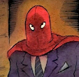
Here is a scene from the book...


Monday, June 22, 2009

Gallery Ghost

A couple of years ago I got an assignment to do the cover ( as well as dozens of interior drawings) for an oversize hardcover book for kids called "Gallery Ghost". The story (actually a clever game) involves the ghosts of artists whose work is in the National Gallery (where the story takes place) coming out at night and adding little details to each other's work. An art student who works the night shift cleaning up the gallery discovers these paranormal hi-jinks and the ghosts allow her to participate in the fun. Anyway -- after the usual round of thumbnails, a cover idea was chosen and a full-size sketch was made.
At the same time I had also done a sketch for a border that was going to go on the title page.


A suggestion was made that perhaps the border could be used on the cover instead, so I did a mock-up to see how that would look.

Luckily everyone agreed it was way too busy. (The border didn't even end up in the final version of the book.) So we went back to the more simple cover illustration. I did the final and the designer added type, as well as the images of actual paintings.