Pages

Showing posts with label Peculia. Show all posts

Wednesday, August 24, 2011

"Doll Parts"

Here is the original, uncropped (un-cleaned-up) art for a strip done especially for the PECULIA book collection ~


Thursday, January 14, 2010

NIGHT GALLERY 2


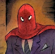
Presented for your inspection -- Three more pictures from the vault...

From top to bottom:
- Art for cover of "Evil Eye" #11
- Art for two-page spread from Steve Nile's DRACULA (Jonathan Harker freaks out)
- "The Pirate's Treasure" featuring the pirate girls from MAD NIGHT, which appeared on the back cover of an issue of "Evil Eye"

Wednesday, June 24, 2009

Vampires!


From the archives: two different versions of the cover art for my modest 2003 vampire novella, Peculia And The Groon Grove Vampires. The first version was misguided, really. I wanted to do kind of an amoeba-shaped portal through which you could see a scene from the story. Well, it looked good as a sketch anyway! The real mistake was doing such a hard-edged shape (which is not the best solution with watercolor, which favors softer edges) and then
making the background a solid black. I often get inspired by cool hard-edged designs on book covers and subsequently make an attempt to duplicate it with watercolor. In never works... And what made it worse was that now the "view" through the portal needed to be lighter, to stand out from the black. So -- that's right, I made it a daytime scene. I have vampires strolling along during daytime. Oops...


Even though I kind of dashed off the second version, it still made a better cover than the first. Neither one has much to do with any actual scene from the story. I just wanted kind of dynamic image to convey a certain mood. I don't know. Like many of my paintings, I wish I had just one more shot to make it better. But you have to let go of these things once they're out there in the world...


Here is a scene from the book...


Saturday, June 6, 2009

For Those Interested In The Process...

I always ink the artwork I do before applying the watercolor washes. Sometimes I photocopy the line art so I have a record of what it looked like in case I screw up the painting and have to start from scratch. (It's easier to start over by tracing line art than a painting). And sometimes I even save the photocopies of the line art, for some reason. Above is the line art I saved for the front cover of the book PECULIA. At the right is a (slightly dark) scan of the painted art, made after coloring with watercolor washes over the ink lines.
The scan was made at the point when I thought I was done. But after living with it some more (always a good idea), I decided it needed more work.
I lightened her dress (a laborious process that involves blotting the painted area with a wet rag or paper towel to slowly lift off the layers of watercolors, without smudging or smearing any of the areas around it). I had wanted a monochromatic look, but there wasn't enough of a range of values, so lightening the dress, and tweaking the color to be more purple than blue, helped. (I changed the color of the cat as well). Then, for balance, I realized I needed to darken the ground, so I did. I still wasn't 100% satisfied, but I knew I was on the verge of overworking it -- the worst thing you can do with a watercolor painting. If it was oil or acrylic or whatever I'd be able to paint over areas -- and you can even "fake" small areas of watercolors by matching the color in opaque gouache and painting over the watercolor that way. But I'm addicted to the light, transparent look of watercolor and although I have used gouache for corrections occasionally, I really try to avoid it, because the comparative heaviness of the opacity can throw the whole "look" off. So, I reluctantly laid down my brushes. (The age-old question for many a painter is "when is the painting done?" It's easier with watercolor, since you are definitely done when you should have already stopped working on it!).


So I packaged the art along with the title logo I'd drawn and sent it to the publisher, who put together a mock-up of the cover for me to see. That's it at the left. And that's what we went with. (Looking at it now, I think I should have added a bit of shading to her dress. Oh well...) Of course, the final printed version often doesn't look anything like the work at
this stage, so all that's left to do is cross your fingers and hope that they get it as close to the original art as possible. It used to be nearly impossible to get an accurate reproduction of watercolor art in print. I used to have to jack up the color intensity with garish dyes to prevent illustrations in magazines and newspapers from looking completely faded out. And you never knew how it would reproduce until you saw it -- an often disheartening experience! Nowadays, though, thanks to computers, you can get closer than ever to what the original painting looks like. Yay for technology! It's given new life to the old arts. (And to the old artists!).