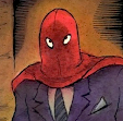
While in photoshop I made some minor adjustments and then got caught up in doing more and more little tweaks and corrections and changes in the art. It was handy and fun to be able to clean areas up a bit, make them clearer. (I had ended up doing a lot of that on Cat Burglar Black).
But other changes I made were completely unnecessary -- I started recoloring figures, reshaping faces. That photoshop can be an insidious thing! I ran right up against that age-old question of all painters: "When is it finished?" I could have kept going indefinitely, making it "better and better" -- it was kind of addictive.
But if I have learned anything over the years it's to accept my artistic limitations. I wasn't using photoshop to improve my skills or learn new ones -- I was using it to change art I had already drawn and painted. So, finally I came to my senses and realized I was overworking the thing and it was time to just stop.
Looking at both versions now, after a couple of years, I have to say that the originals are better - none of that tweaking was necessary, really, beyond cleaning up a few messy spots. I hadn't really improved anything. I had just removed more and more traces of the human hand from the art.
Don't get me wrong -- I'm sure that for most young artists who have grown up using computers that photoshop (or whatever gizmo one may use) IS like an extension of their hands. It's just another tool after all - anyone will tell you that. (Actually everyone will tell you that). It ultimately comes down to having that necessary drive to do the best work you can do, whatever you're using.
I'm posting the non-tweaked original panels here -- and at the bottom is the final (tweaked) version that was printed in Kramer's - (plus a photo of the actual book) so you can see what it looked like all put together.


thank you for sharing these things.
ReplyDeleteI've got my copy of Kramers propped awkwardly on my computer table, trying to detect all the differences...an interesting exercise! The only things I've noticed so far are the guy in panel six licking the candy cane seems to have had his head "squashed in" a bit and the "End" lettering is in a different colour...I'll try to find some more, though!
ReplyDelete