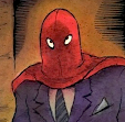


MAD NIGHT (2005) - Images from top to bottom:
1) This is a "fake" cover done for full page ad in the Norton book catalog. Book distributor Norton always needs cover images early for solicitation purposes - so early that I usually change my mind about what I want the cover to look like. And being aware of this I sometimes create a fake cover to act as a "space filler" until I decide what I really want to do. I've had (I think) six of my books (published by Fantagraphics) listed in the Norton catalogs and I don't think a single listing ever showed the actual cover I ended up using on the published book.
2) Line art for the final cover. Some of my (pre-watercolor) line drawings can stand on their own as finished artwork. But this one really needed the color to bring it into focus.
3) Title lettering
4) Mocked up color sketch. I believe the reason for the note at the bottom was because this image was used in the Diamond solicitation catalog (for comic book stores). Again -- you just need something, some kind of cover image to go with the description of your book - and I hadn't finished the real cover yet! You can get away with using rough sketches sometimes, because the covers are printed so small. But I think I remember that this one looked pretty awful -- all muddy and blurry. Oh well... my own fault.
5) Final printed front cover (with spine). The process of making a cover - from the early ideas and sketches to creating the final art - has always been one of my favorite parts of being a published cartoonist. I'm no designer and I'm aware of my many limitations, but I've been a fan of cover art since I was a kid, so I enjoy drawing sometimes two or more covers for the same book -- even if only one of them ends up getting published.
5) Final printed front cover (with spine). The process of making a cover - from the early ideas and sketches to creating the final art - has always been one of my favorite parts of being a published cartoonist. I'm no designer and I'm aware of my many limitations, but I've been a fan of cover art since I was a kid, so I enjoy drawing sometimes two or more covers for the same book -- even if only one of them ends up getting published.


Love these behind the scene looks at your work. The only thing I like more is when a new book comes out. I can't wait for The Hidden!
ReplyDeleteHi Richard,
ReplyDeleteHave to agree with kevhines that these behind the scenes are very interesting! Stupid question perhaps: Did you use the original line art for the final cover?
Btw. Frederik Peeters also has an interesting blog where he's showing the process of his latest opus : http://projet-aama.blogspot.com/ . He has also done a terrific project called portraits as living deads (think this might interest you):
http://projet-aama.blogspot.com/http://portraitsaslivingdeads.blogspot.com/
Thanks, guys.
ReplyDeleteDries - Yes, that is a photocopy of the line drawing - in ink on watercolor paper - that was then painted over with watercolor and used as the final cover.
Thanks for those links -- I'll check them out!